
Saint Paul Snow Emergency Parking App
Creating a Location Based Application
Summary
Situation: Parking in Saint Paul in the winter is stressful, especially during a snow emergency. Accessing the current snow emergency parking map for Saint Paul takes multiple steps that users don’t have time for.
Goal: Combine my digital mapping background with my UX experience to create a location based app to quickly and simply show users where they can and cannot park in Saint Paul during snow emergencies.
Process: Utilized a competitive audit and heuristic analysis to validate the importance of a resource like a parking map app. Multiple rounds of usability testing to understand how actual users would use this app.
Result: A high fidelity interactive prototype where users can easily view the the parking rules during a snow emergency along with an interactive map to know where parking is allowed and/or not allowed.
Winter Parking Is Not For The Weak 🥶
If you don’t know the struggle of parking a Minnesota winter, just take a peak at the pictures below for context. Scary, I know.
As a response to snowstorms like these, the city of Saint Paul, MN will often declare snow emergencies. Anyone who has parked in Saint Paul during a snow emergency knows the difficulties of finding parking without the threat of a ticket. As a former Saint Paul resident myself, I had the same question every time a snow emergency was declared… Where do I park?! Like so many others, I often would follow the lead of those parked near me. However, as the snow melted, so did the memories of the parking confusion from each snow emergency.
When I thought of problem spaces in my everyday life, this parking dilemma came to mind. I talked to fellow residents and they also felt the pain of this problem. Some had stories of getting parking tickets, one had a slightly funny story of getting their car towed, and everyone agreed that parking in the winter is just confusing. We all were asking the same question.
How can I quickly and easily know how to park in a snow emergency?
To try and answer this questions, I paired the UX side of my brain with the Digital Mapping side of my brain and came up with the start of the solution: A Snow Emergency Parking App
Let’s Learn About Snow Emergencies ⛄️
Defining The Users and Their Goals 🚗
I defined my users as Saint Paul residents, workers, and visitors all with access to a car. I had two key goals I needed to understand about this group.
Understand how they know when a snow emergency is in effect.
Understand how they know when and where they can and cannot park.
Competitive Analysis 🥊
After defining the goals for my users, I began my research with a competitive analysis. I chose this method because I wanted to know how the Saint Paul snow emergency webpage stood up to similar cities. I chose to compare it with the snow emergency webpages of Minneapolis, MN, Madison, WI, Des Moines, IA, Bismarck, ND, and Fargo, ND. While these cities had varying populations (Bismarck, ND with 74,138 vs. Minneapolis, MN with 425,336), the winter weather was relatively similar. For each city’s website, they offered:
Basic information about snow emergency procedures
However, that’s where the similarities ended. Madison, Des Moines, Bismarck, and Fargo are all subpar compared to Saint Paul and Minneapolis. The Twin Cities websites are by far the most informational, inclusive, and accessible websites. They both offer:
Information in multiple languages
Interactive parking maps with rules
Multiple touchpoints for residents to sign up for alerts when a snow emergency is declared
FAQs answered
Informational videos
The two websites succeed in informational hierarchy, design layout, and knowing their users. I took all this information into consideration as I moved onto a heuristic analysis of the Saint Paul webpage.
Screenshots of the websites can be seen below.
Saint Paul Snow Emergency Webpage
Minneapolis Snow Emergency Webpage
Heuristic Analysis 👀
I used Nielson’s 10 Usability Heuristics to determine what was working for the website and what could be improved upon. I wanted to know this information for two reasons.
To replicate the information and design success of the website into the app
Understand how the interactive map is utilized on the website
The most prominent part of the app will be the parking map, so knowing if it is demonstrating of violating these heuristics will help determine how to display information within the app, while fulfilling the user’s goals of quickly and easily knowing where they can park.
The website proved to successfully demonstrate all the applicable heuristics. The only real trouble came up when it came to finding the interactive parking map. The map is incredibly useful and follows basic map design principles well, however it is not clearly visible unless the user scrolls down the page. This violates the flexibility and efficiency of use heurisitic.
Usability Testing 🗣️
I started off by testing Saint Paul’s snow emergency webpage and the map. I tasked the first round of participants to navigate to the webpage, find the map, look up an address, and understand the parking rules for that location. The participants that I interviewed had two main takeaways.
The snow emergency webpage was easy to use
Finding the interactive map was too time consuming to navigate to and figure out
I asked the participants to rate the likelihood of them using a location based app with the same information on a scale of 1-5, with 5 being very likely. They rated it an average of 4.7/5 which validated that this information would be useful for users in an app form.
Design Decisions ❄️
Accessibility
Since I was creating an app that would be funded by the city, I made sure to incorporate accessible design into my prototype. I focused on using a basic color scheme that was easy to read, having my font at 14 point minimum size, the buttons were 34x34 pixel touchpoints, and the content was straightforward and easily understandable.
Design Decisions 🤔
Besides focusing on accessibility, I struggled with where to start on my design. There weren’t many features to create for this app and I had to get creative with making an interactive map in Figma. I decided to test the Minneapolis winter parking app with users. They mentioned how they liked the simplicity of the app. There was a home screen, but the key function was the interactive parking map along with the easily accessible parking rules.
Minneapolis and Saint Paul have different rules when it comes to snow emergencies so I was able to keep the design unique to the city and it’s rules.
The Final Design 🎉
I kept in mind that this app, if it were created, would be funded by the city or state. I made sure to follow the design principles that the city uses to keep it on brand. For the map, I used the same map that is available online in order to keep it consistent with the website. Below is the process of how a user would use the app.
Start with a push notification
Open the app in the night plow route since snow emergencies always start on the night plow route
Banner at the top of the app reminds the user if there is a snow emergency in effect or not
The user can select the day or night plow routes at the top
The user can easily find the rules simple stated under the info button
The user can click the current location icon in order to find the parking rules near them or type in an address
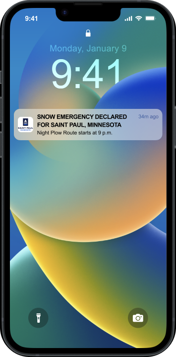
The user is prompted with a push notification when a snow emergency has gone into effect.

The view of the night plow route with an interactive map so the user can determine where they can park throughout Saint Paul.

The view of the night plow route rules are accessible when the info button is selected. Easily reminding the user of the rules.
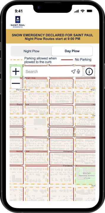
The view of the day plow route with an interactive map so the user can determine where they can park throughout Saint Paul.
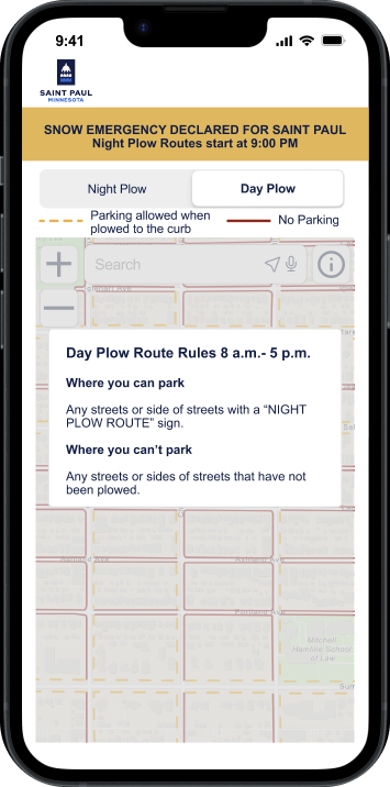
The view of the day plow route rules are accessible when the info button is selected. Easily reminding the user of the rules.
Next Steps 💭
This app has a multitude of path it could take in the future. Thinking about next steps, I would want to:
Test the app in a ride along with potential users during a snow emergency to see how they would actually use it
Update the map to include more layers and accessibility features
Incorporate surrounding cities and their rules into one app so the user can use it throughout the Twin Cities